“Sorry, I’m giving up on this!” I was responding to an airline’s flight experience survey via my mobile phone. The airline in question had taken good care of me and enabled me to carry my precious cat as hand-luggage from Hong Kong SAR to Amsterdam. I was willing to give them a great rating for every aspect of my experience, from booking to food to inflight service. But during the process of answering their questions, I reached my tolerance limit for the task. Providing a seemingly endless stream of responses within a continuous grid layout was simply too mundane and boring.
I got to the point where I was just entering random responses in a quest to get to the end. Which did nothing for the accuracy of their results and lowered my overall glowing perception of the company. Nobody gained anything.
Why mobility matters
The use of mobile devices is continuing to grow rapidly and is a not-to-be-ignored element in the online communication mix. In some parts of the world, mobile now exceeds the use of traditional desktop machines.
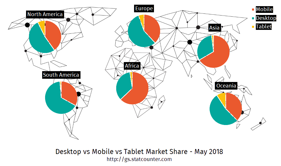
Go to StatCount to find out how the mobile coverage is defined in your region.
So how does this impact your surveys?
Because mobile devices have smaller screens than desktops and are often used away from the calm, static office environment, they need to deliver content in a way that’s more instantly digestible and engaging to keep users focused. When it comes to surveys, long, boring-looking questions are doomed to failure, as they demand too much effort. User attention is best achieved by keeping them entertained.
For this reason, you need to think a lot more carefully about how to approach and design surveys. Yes, you’ll need to invest time and effort, but the rewards will be noticeable, with significantly higher response rates and better quality answers.
Go mobile first
You’ve probably heard of the term “mobile first”. This refers to the principle of initially designing all content to meet the needs of mobile users, then adapting it afterwards for desktop consumption.
Designing surveys in this way starts with considering the specific requirements of mobile users. For example:
- The survey needs to be kept short. Completion must be possible in under 5 minutes
- Each page must be easy to read and fit comfortably on a small screen, without scrolling
- Avoid large tables with endless statements
- Use simple sentences and only ask what you really need to know
- Surveys need to be as interesting and engaging as possible. This can be achieved through techniques such as gamification, easy-to-use interface and variety of question types
The solution is right here!
Nfield surveys are designed to accommodate a mobile first strategy, while continuing to satisfy desktop users. For a start, our layouts are fully responsive to all screen sizes and device types. You only have to create your survey once, while Nfield automatically detects the nature of the screen it’s being viewed on and presents the most appropriate layout. So every user experiences your survey in an optimal way, no matter what device they are using, even if they switch mid-completion.
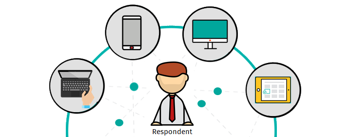
Switching between devices while continuing the same activity is a recognized phenomenon. Just as Netflix lets you seamlessly continue your viewing as you switch between television, tablet and phone, Nfield lets survey respondents start on one device and continue on another. This relieves pressure on respondents to complete the survey while on-the-go. Their already-entered answers are stored and they can continue right where they left off, on any device.
What’s more, Nfield makes the most of mobile respondent behavior and delivers a range of additional benefits, including:
- capturing on-the-spot feedback from customers
- obtaining faster responses
- achieving better coverage of some demographic groups
- enabling improved quality checks (for field work) with photographic and GPS evidence
More of what your mobile users need
By ensuring your surveys truly meet the needs of mobile users, Nfield sets you up for survey success.
More fingertip-friendly
“Clickable” on-screen elements are very reactive and easy to use, without the need to trigger the magnifying glass feature offered by some devices.
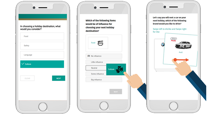
Nfield capitalizes on mobile users’ instinctive actions by presenting functionality in similar ways to commonly used apps. For example, questions can be answered by drag-and-drop or by swiping, thereby adding variety and keeping users engaged.
More Graphics
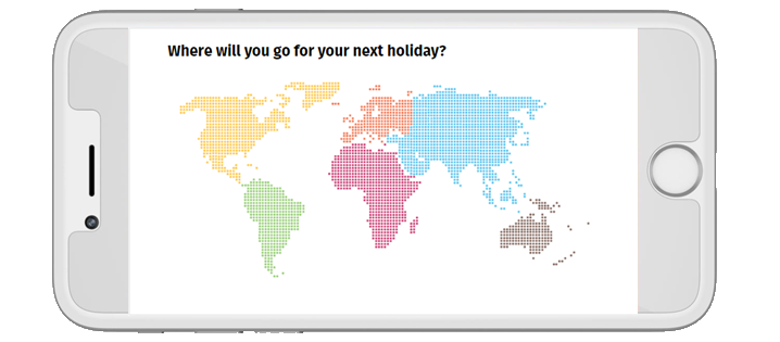
Images play a big part in giving respondents an enjoyable and engaging experience. But it is essential to keep your image file sizes to a minimum. No one wants to wait for an 8 MB image to load before getting on with the survey! There are many programs available for reducing image size without losing sharpness or causing distortion.
Once you’ve taken care of the size of your image data, Nfield takes care of the size of your image on the screen, automatically adjusting each one to fit. So no matter what device or screen size your respondent is using, they always get a perfect view without having to scroll.
Nfield also enables the use of images for answering multiple code questions. Sometimes using icons (with single color) can be a good way to reduce boredom and improve the experience.
More variety
Nfield provides a good variety of question types to make the whole experience for your mobile respondents more engaging.
You can use drag-and-drop, image maps, sum sliders, star-ratings, matrices and more. Mixing these up within a survey creates variety which keeps the respondent more attentive and focused, which will result in better data quality.
Nfield even takes care of matrix questions, which can be a real problem on mobile devices if not correctly resized. By automatically re-structuring these into a card presentation for mobile devices, Nfield makes matrix questions as easy as any other to answer. Readable, finger-tip friendly and fully aligned with the mobile first principle.
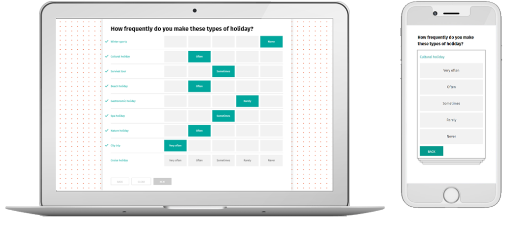
Click the following link to see how Nfield Online looks on your smart phone, tablet, laptop or desktop. Get a first-hand experience of the benefits of mobile first!
Nfield takes you further
Are you looking to improve your response rates? Are your surveys delivering an enjoyable experience to respondents? Feel free to share your example with us so we can examine it together and identify where improvements can be made.

